Graphic Props From the Files of Mrs Basil E. Frankwieler
My design brief was based around creating graphic props for a film inspired by a novel. The idea behind this is about creating graphics to help tell a story in the same way a director (Wes Anderson) or production company (Indian Paintbrush Films) creates a whole world to tell a story. This included doing research on the time period and place the novel is set, to narrow in on the design style needed for the props to embody the time and place. I developed a body of work specifically for graphic design in filmmaking which included, hand lettered signs, letters, a museum map, train ticket all based around the novel by E. L. Konigsburg, From the Mixed up Files of Mrs. Basil E. Frankweiler.
The Graphic Props
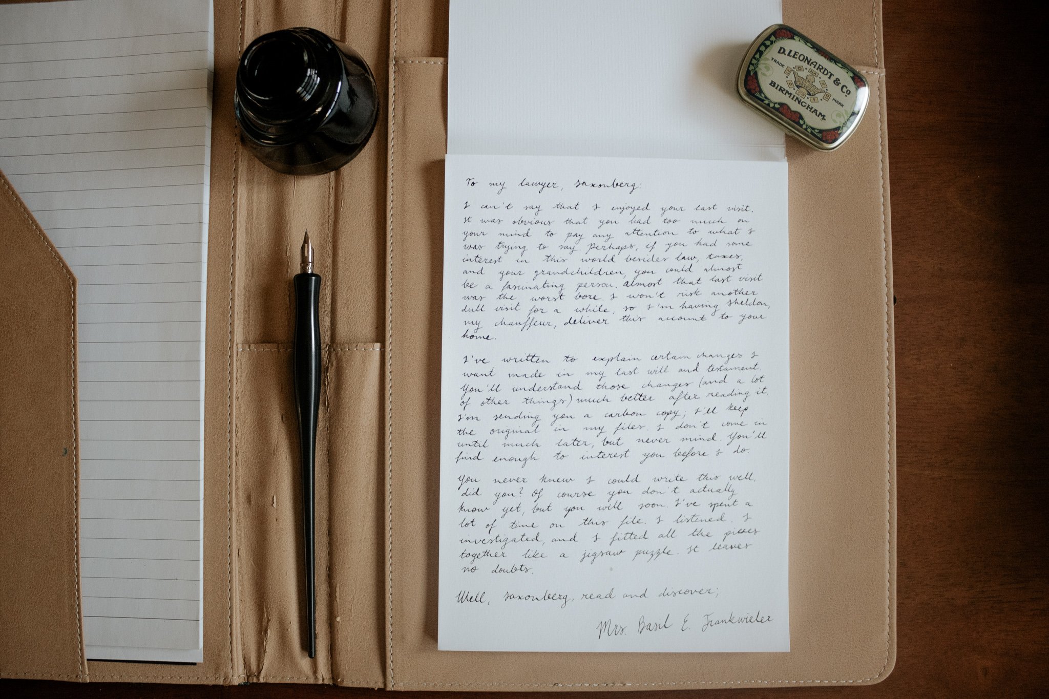
A letter from Mrs. Basil E. Frankweiler to her lawyer, Saxonberg, starting the story. I used black ink and dip pen on laid paper, which was the predominant kind of paper produced in the 12th century into the 19th century. While the story does not have a set time, I placed it in 1954, which was a few years before E. K. Konigsburg wrote and published the novel. I used a calligraphy pen as I felt that Mrs. Basil E. Frankweiler would still be quite traditional in her stationary collection, being older and quite wealthy.


During the 1950s, the fountain pen was still the most standard used writing tool especially with brands such as Schaeffer being popular in the market, therefore I chose to write with a fountain pen for when Claudia writes, as she probably would have received one from her parents. She writes a to do list for her brother to follow before they run away using blue ink. The last list she makes is the topics the two of them must search through Mrs. Basil E’s files to locate the answer to the mystery.
To get to New York City, Claudia and her brother use a train ticket found in the waste basket of their parent’s bedroom. It’s their father’s ticket and which usually would be collected at the end of ten continuous trips, as it has not been collected the pair can use it as a half fare each to get to New York. I used illustrated to create the ticket and added a hand-drawn signature and date, and hole punches which would have occurred once the ticket was purchased.
The marker/felt-tip pen became popular in the 1950s and was usually made to write on many different surfaces. For this reason, I used felt-tip pens for the hand-lettered signs found in the drug store window and the checking room at the Metropolitan Museum of Art (Met).
When they finally reach the Met they are told to check in their bags as it is a museum rule. I used illustrator again to print out a sign, as the museum would have spent money to make sure they have a sign for when patrons enter. In contrast to the previous “no tipping sign”, which an employee might have made to stop patrons from tipping when they checked in their bags and belongings.


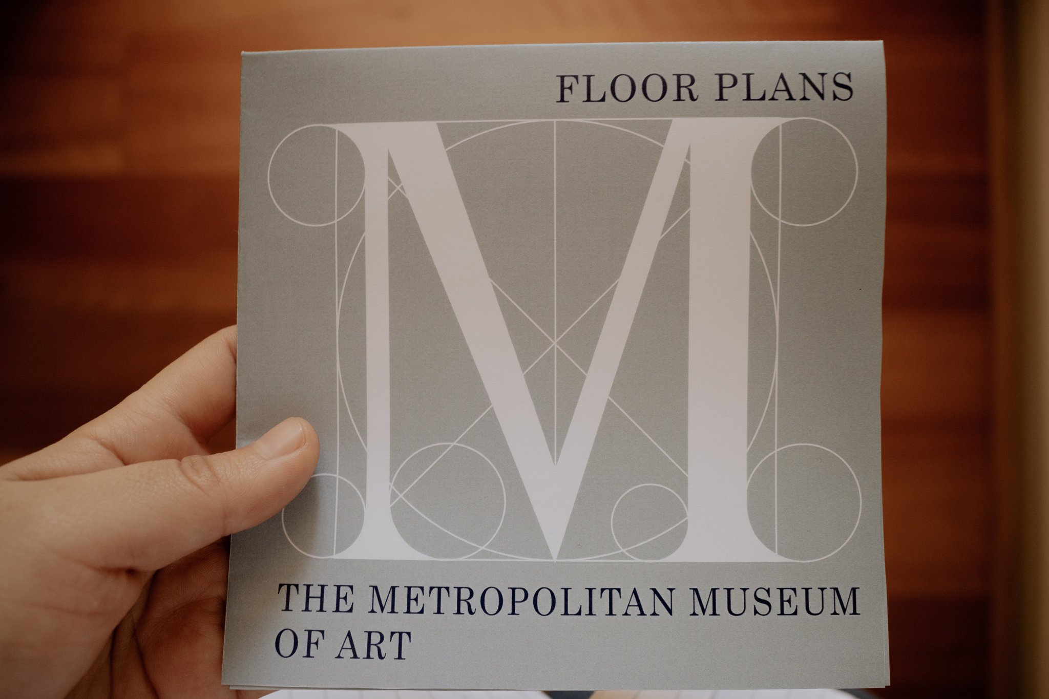
At the Met Claudia uses the museum map to figure out where she and Jamie, her brother, could hide when the museum closes.


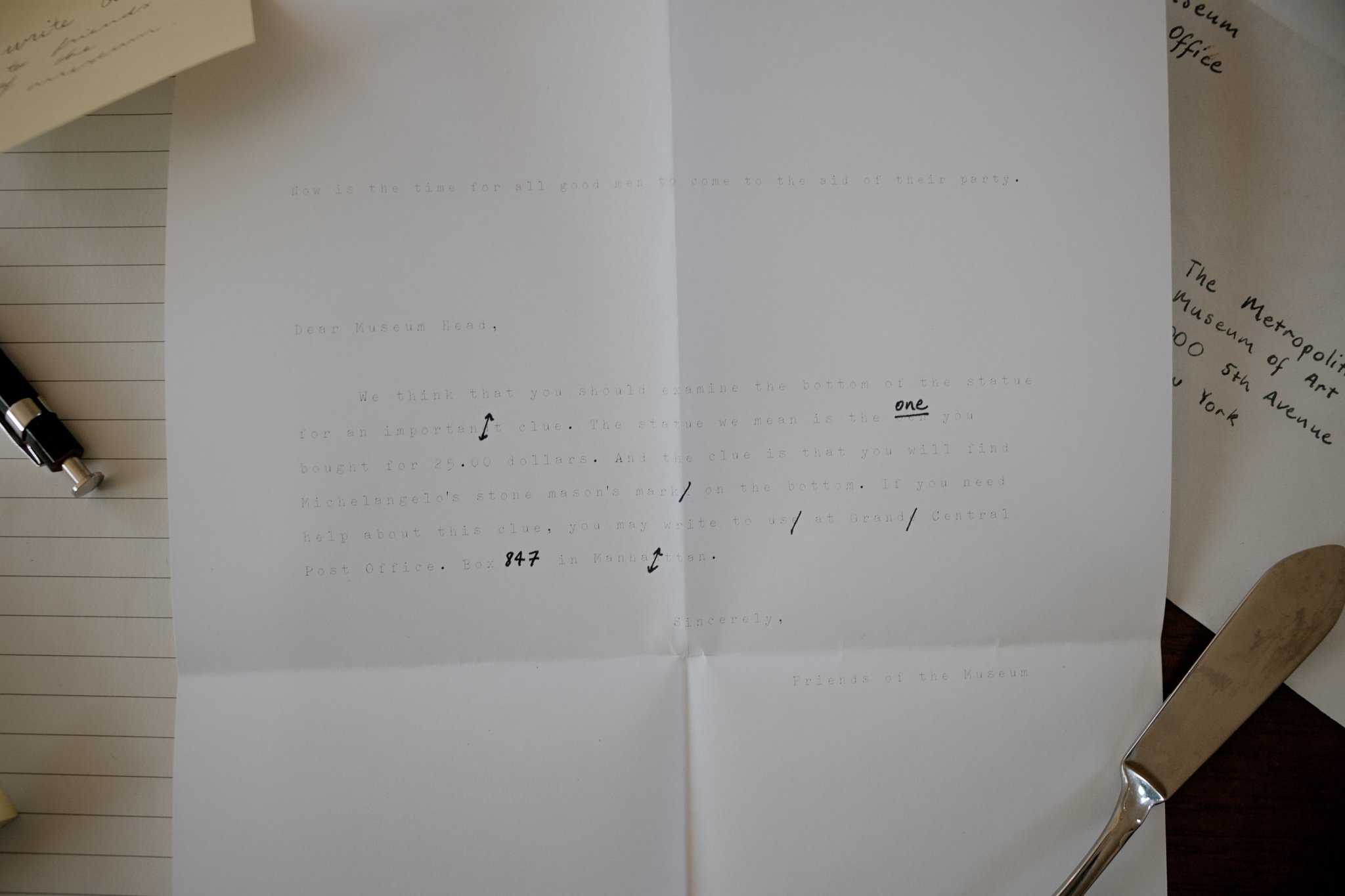
The last two props are “typewriter” typed letters. I used typewriter fonts in Illustrator to create the effect. The letter from Claudia and Jamie as “Friends of the Museum”, was typed using a free typewriter on the streets of New York. For this reason, the letter is not very clear, as if the typewriter ribbon was drying out. Claudia is also not very well versed in typing with a typewriter so there are errors in the letter which have been crossed out and edited using a black pen. In contrast, the letter from the Museum to the Friends of the Museum, is much more professional, with no errors, a strong, clear black font and the signature of the Museum Director.


